React Components
Brail provides several key components for producing reliable, responsive email templates. These components are unstyled and built to be extended with your own styles.
Below is merely an overview of what components are available. For a more detailed description of each component, please the component's TSDoc definitions, in code.
Currently, documentation of component props is done via TSDoc. At some point we will release more detailed documentation.
The below examples have had minimal styles added for illustrative purposes.
Core Components
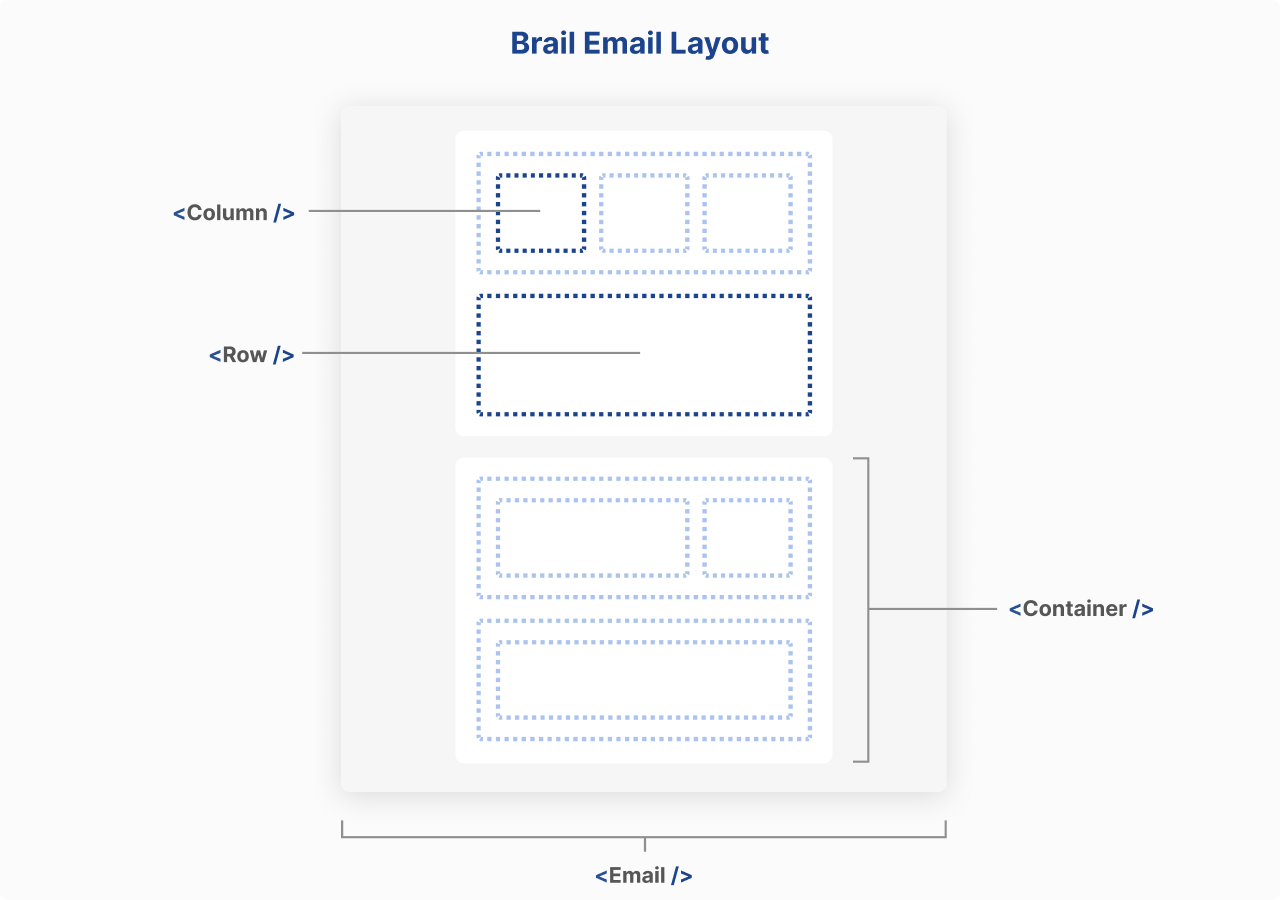
While Brail strives to hide the complexity of email HTML, there's no avoiding the use of a table-like layout. Brail implements this through the <Container>, <Row>, and <Column> components.
These core components do the most heavy lifting and are concerned with producing reliable layouts. As such they are indispensable for crafting emails.
<Email/>
The <Email/> element is the root of your template. It contains everything else and allows setting some global options like a baseUrl for relative URLs.
<Container/>
<Container>s aren't strictly necessary, but they center your content and provide a typical email "content" container, so are recommended.
Any content, like text and images, must live in a <Column>, and any <Column>s must live in a <Row>.
<Row>
The <Row> component is a horizontal container for <Column>s. Any <Column>s must live in a <Row>.
<Column>
The <Column> component is a vertical container for content. Any content, like text and images, must live in a <Column>.
<Row>s can be nested in other <Column>s to create nested layouts.
Example layout
<Email>
  {/* Container 1 */}
  <Container backgroundColor="grey">
    <Row>
      <Column>{/* Content */}</Column>
    </Row>
  </Container>

  {/* Container 2 */}
  <Container backgroundColor="blue">
    <Row>
      <Column>
        <Row>
          {" "}
          {/* Nested <Row> */}
          <Column>{/* Nested content */}</Column>
          <Column>{/* Nested content */}</Column>
        </Row>
      </Column>
    </Row>
  </Container>
</Email>
Content Components
<Typography>
The <Typography> component is used for adding text content. This component is more robust than regular HTML text elements like <p> or <h1>, <h2>... tags, but you are also free to use those.
<Image>
The <Image> component is used for adding images to your email. It's a wrapper around the <img> tag, but performs additional validation of the src prop and produces more reliable HTML.
<Link>
Like <Image>, <Link> validates any URLs it's passed, ensuring more reliable templates.
<Button>
The <Button> component is similar to
What about vanilla HTML?
Brail reserves the right for developers to go "off-piste" and use whatever other components they want, including regular HTML elements. However, in doing so, the guard-rails are dropped and ensuring your email renders correctly is up to you.
With that said, Brail provides a linter which provides warnings about email support for various elements, CSS properties and other features. And as per usual, you can always test and preview your templates to be sure.